Case 01

Asta eStudio — Rebrand & website
Client
Asta (own brand)
Platform
Vue.js
Scope
Rebrand · UX · UI
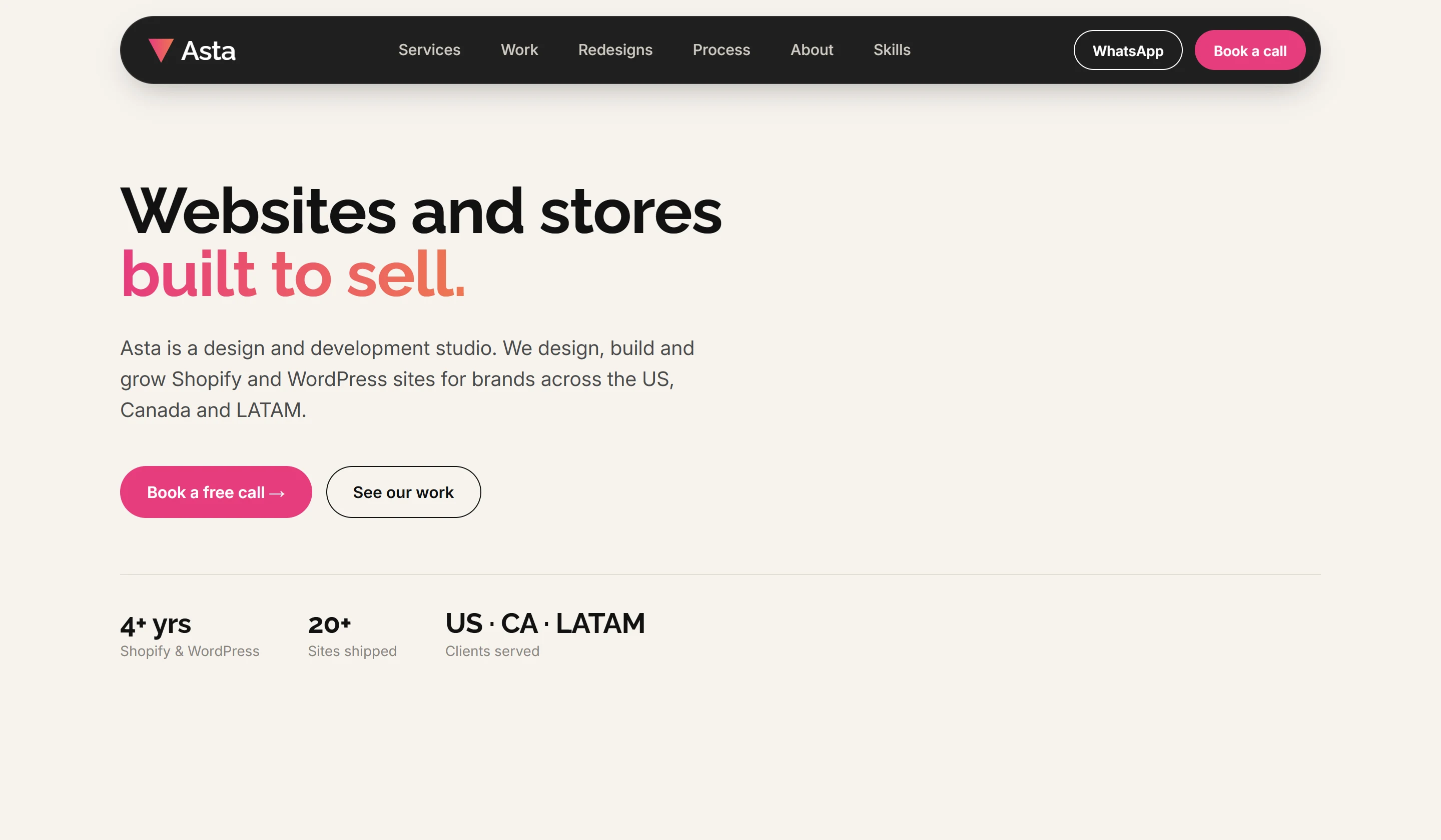
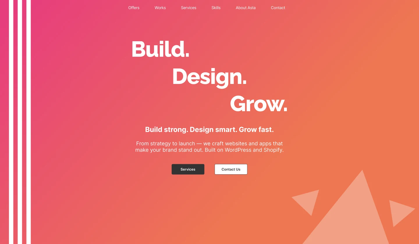
Old Asta homepage hero with a pink-orange gradient
Before
New Asta homepage hero: Websites and stores built to sell
After

Homepage hero: old version (left) and the rebrand (right).

What changed

Four improvements that make the difference.

  1. 01

    Clear value proposition

    Before: a slogan with no context. After: what we do, for whom and on which platforms, in one line.

  2. 02

    A brand system, not gradients

    Before: pink-orange gradient everywhere. After: neutral base, two brand colors as accents and one consistent type scale.

  3. 03

    Work shown as brands

    Before: tech tags and tiny screenshots. After: client brands front and center, with platform and role on each card.

  4. 04

    Conversion paths everywhere

    Before: one "Contact Us" button. After: book-a-call, WhatsApp and a short form with the project type.
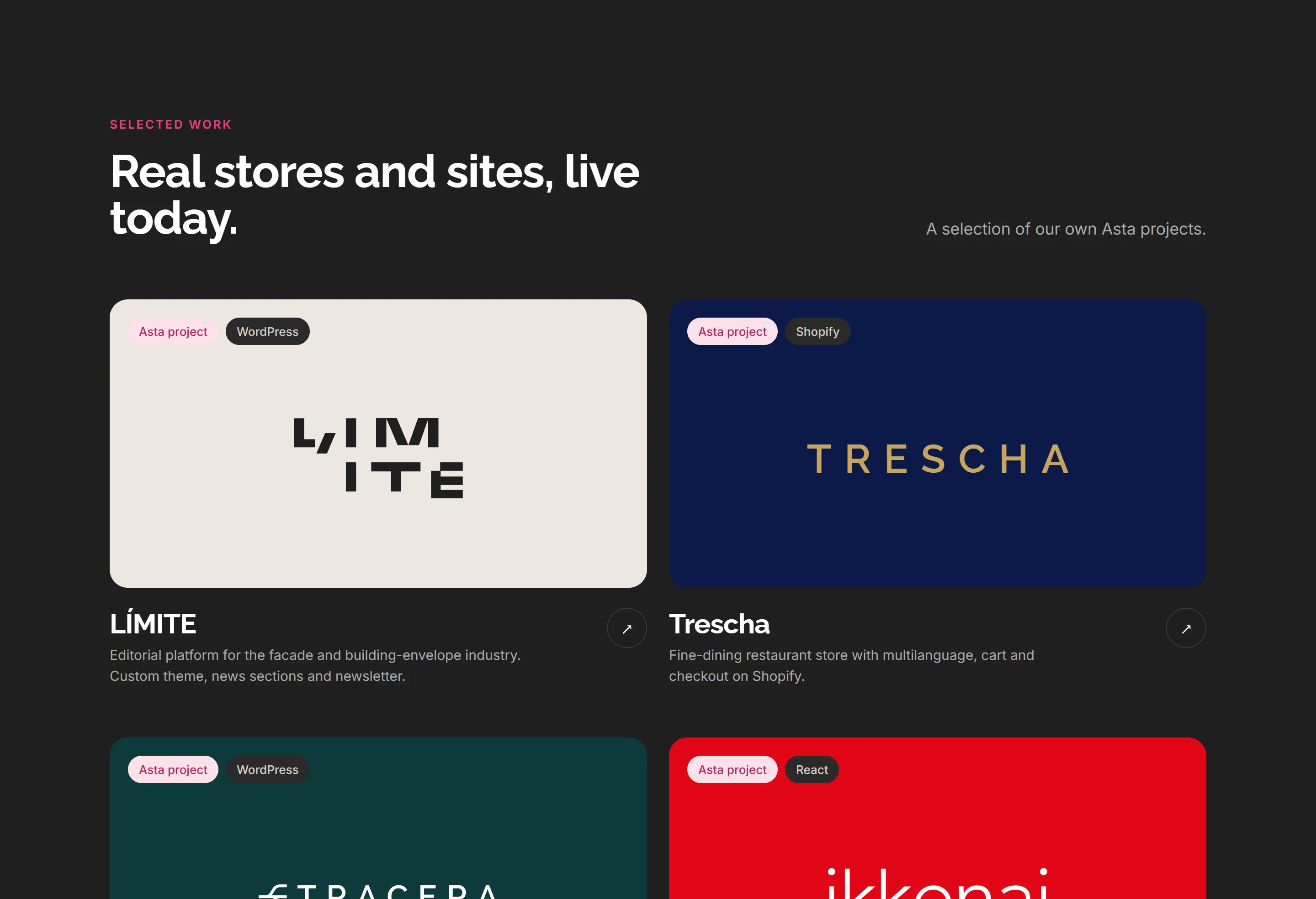
New Selected work section with client brand cards

Projects section

Brands first, tech second.

  1. A headline that sells the work

    "Real stores and sites, live today" replaces a generic "Design." heading.

  2. Each card is the client's brand

    Brand color and logo instead of small screenshots, so every project reads at a glance.

  3. Clear ownership and platform

    Tags show it's an Asta project and the platform it's built on, so visitors know exactly what we did.
Case 02

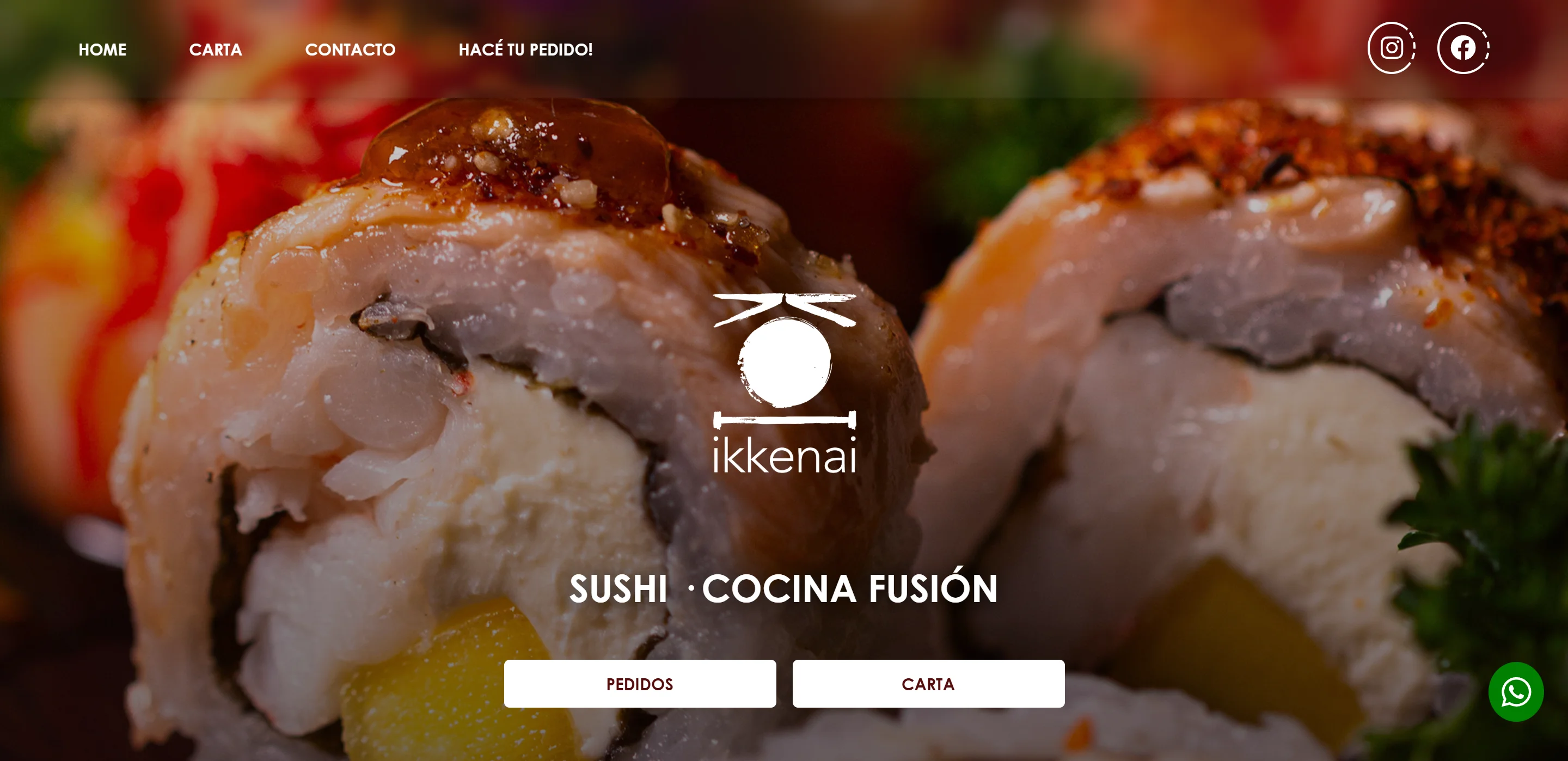
Ikkenai — Website refresh

Client
Ikkenai
Platform
React
Scope
UX · UI · Front-end · SEO

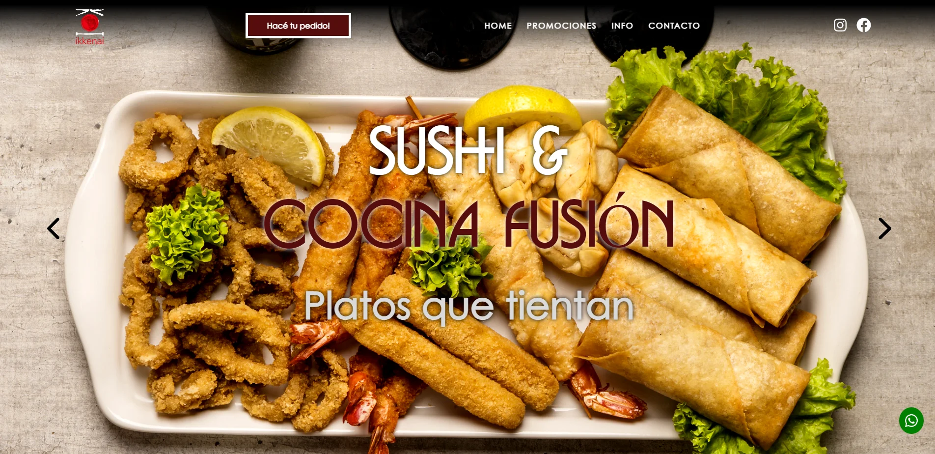
Homepage hero: old version (left) and the refresh (right).

What changed

  1. 01

    Rebuilt with React and AI

    An AI-assisted workflow in React made the refresh faster to design, build and ship.

  2. 02

    Faster and SEO-ready

    Optimized load times and a clean, search-friendly structure so the restaurant is easier to find.

  3. 03

    Mobile CTAs that sell

    Order and menu buttons up front and easy to tap on mobile, so visitors go straight to ordering.

  4. 04

    A menu made for mobile

    The carta was redesigned to read comfortably on a phone, with dishes that are easy to browse.

Want your site to be the next case?

Tell us about your website and we will send you a quick review with the first improvements.

Get a free review →